Visual Aids
Visual Aids should
aid your presentation, not duplicate it or distract from it. Indeed, use of simple, readily assimilated visuals can allow you to provide a quick overview and essential background for the project, freeing you up to use most of your time to focus on the areas in which you need most feedback.
Tips
The following apply just as much to PowerPoint slides as to old-fashioned overhead transparencies:
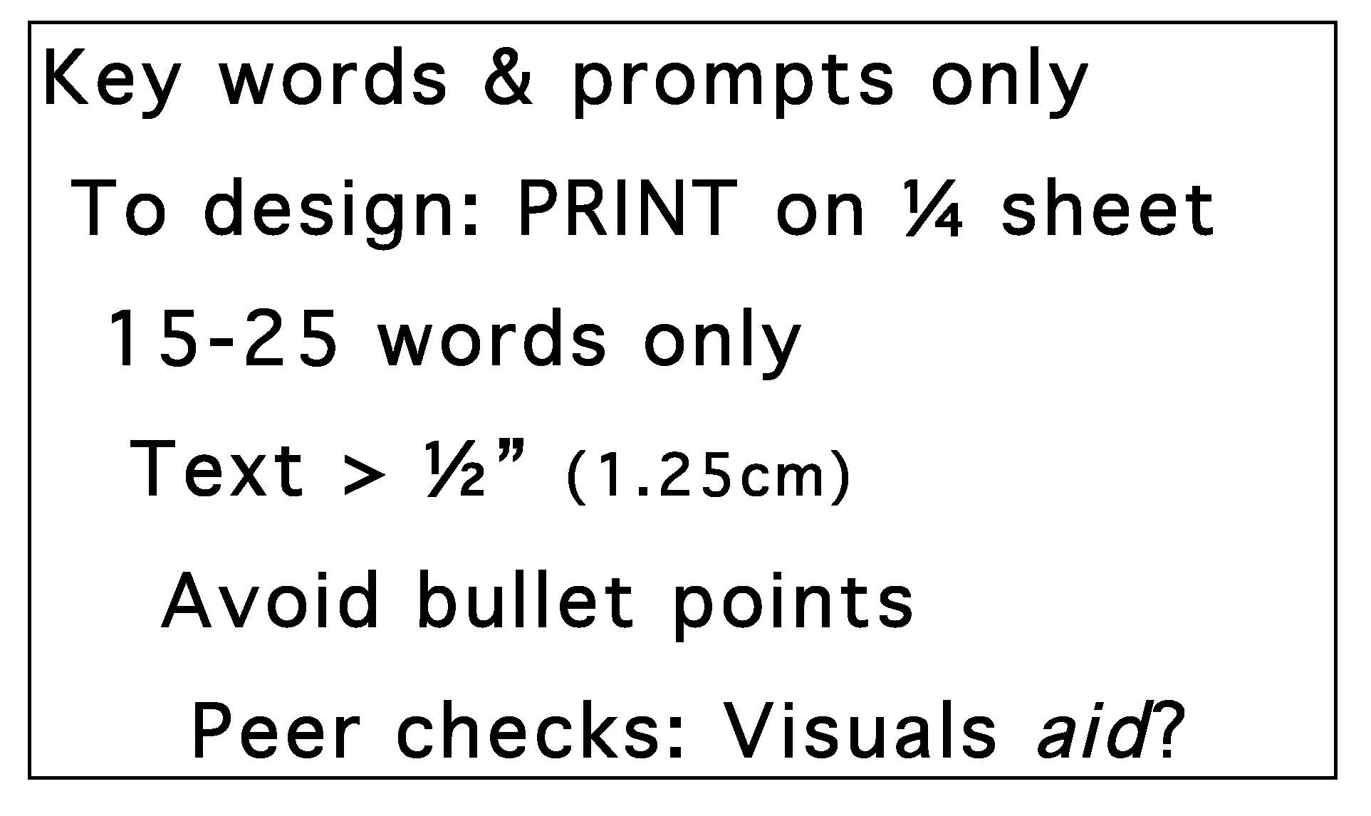
Include only key words or prompts to what you are going to say.15-25 words only on any one visual.1/2 inch (1.25cm) high text or larger.
Design your Visual Aids not on full size sheets, but inside quadrants of a single sheet of paper divided into four parts. Print your words in these quadrants, then scale up to the actual visual aid. This approach ensures that you will not squeeze too much text in one slide.
Be wary of bullet points (except when topic is a list of items such as these tips).
(The typical problem with bullets is that, even when all of the points may be relevant and interesting, the variety of the way the points are phrased and their order does not convey a flow in which each point prepares the way for the one that follows. If you are accustomed to making points in bullet form, ask a peer or your advisor to take notes as you practice speaking the words that explain your bullets. Then use those notes to rephrase and order the bullets so the flow or logic is evident in the visual, that is, can be taken in without your spoken narrative.
Practice your presentation using the Visual Aids in front of a peer who is given specific instructions to note when the Visuals Aids interfere—not aid—or are not referred to.
 A visual aid on tips for the preparation of visual aids (not to scale)
